
On this post I am sharing some monochrome impact in Pumpkin Pie
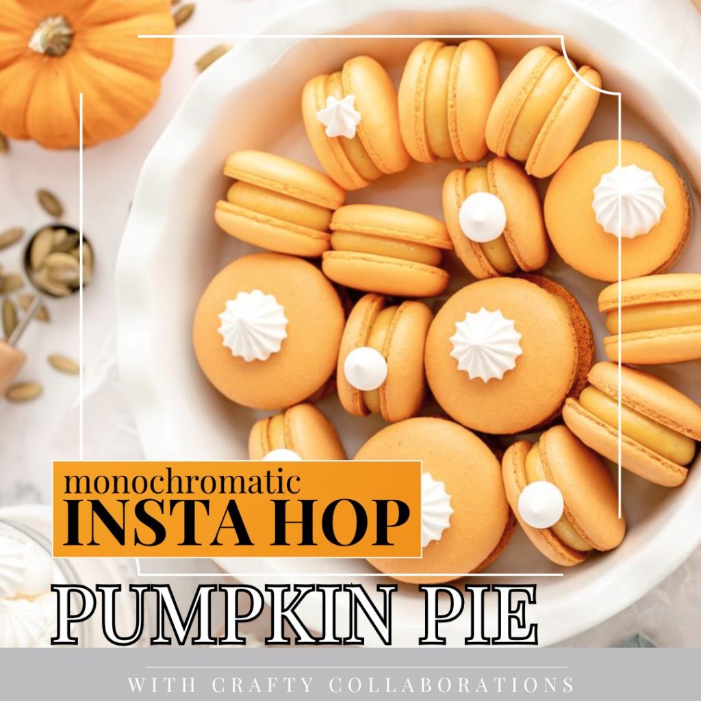
Each week Demonstrators from the Crafty Collaborations Community take part in a Monochromatic Insta Hop over on Instagram. Each week a different colour is chosen and the participants create a monochromatic card.
Last week we featured Pumpkin Pie
You can see a full list of the products I have used at the end of the post, including links to my online shop.
Monochrome Impact in Pumpkin Pie
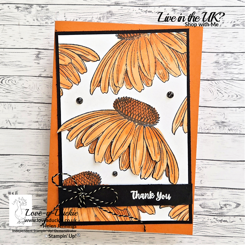
This card is all about bold colour, repetition, and contrast. Another monochromatic design, but this time I leaned into a much stronger, more graphic look using Pumpkin Pie as the star of the show.
Repeating stamped background
I started by stamping the large flower image from the Coneflower Celebrations stamp set several times across Basic White cardstock, using Memento ink. Stamping the same image repeatedly is a great way to create a striking background while still keeping things clean and uncluttered.
Once the stamping was complete, I coloured all the flowers with Pumpkin Pie Stampin’ Blends, keeping the colouring fairly simple and consistent so the overall look stayed cohesive.
Decoupaged focal flower
To add a bit of extra dimension, I stamped the flower image once more, coloured it again, and then decoupaged just the outer petals on the centre flower. This small step adds depth without overwhelming the design and helps draw the eye into the card.
Sentiment and contrast
The sentiment, also from the Coneflower Celebrations set, was heat embossed in white onto Basic Black cardstock. I love how crisp white embossing looks against black – it really pops and adds a touch of elegance to an otherwise bold card.
To finish off the sentiment strip, I tied on a small bow using Black & Gold Twine, which adds just a hint of texture and ties in beautifully with the darker accents.
Finishing touches
A black mat behind the stamped white panel helps frame the design and makes the Pumpkin Pie colour stand out even more. A few subtle dark embellishments finish the card without distracting from the main floral pattern.
Why this design works
- Repeating one image creates instant impact
- Monochrome colouring keeps it bold but controlled
- Black accents add contrast and sophistication
- Simple techniques with a high-impact result
This is a great example of how limiting your colour palette can actually make a card feel stronger rather than simpler. If you enjoy bold florals and clean layouts, this is definitely a technique worth revisiting.
Join The Hop
To see all the projects in this hop, head over to my Instagram page and follow the links from my post. It is never too late!
How Can I Help?
Look out for more monochromatic projects most weeks.
Don’t hesitate to get in touch if I can help with your purchases, or if you have a crafty question.
Meanwhile stay safe and stay well
Helen xx
If you live in the UK, I would love you to choose me as your demonstrator.
- You can shop here or click on the images listed below.
- sign up for my newsletter to receive news and inspiration
- Find out more about joining my team to get a 20% discount on your craft supplies
- email me if I can be of any assistance.
- Make sure you use the current host code so I can thank you for your order.
- Anyone purchasing from me will receive a Tutorial Bundle as a Thank You.


![Coneflower Celebrations Photopolymer Stamp Set (English) [ 165247 ]](https://assets1.tamsnetwork.com/images/EC042017NF/165247s.jpg "Coneflower Celebrations Photopolymer Stamp Set (English) [ 165247 ]")
![Pumpkin Pie A4 Card Stock [ 108601 ]](https://assets1.tamsnetwork.com/images/EC042017NF/108601s.jpg "Pumpkin Pie A4 Card Stock [ 108601 ]")
![Basic White A4 Cardstock [ 166781 ]](https://assets1.tamsnetwork.com/images/EC042017NF/166781s.jpg "Basic White A4 Cardstock [ 166781 ]")
![Basic Black A4 Card Stock [ 121688 ]](https://assets1.tamsnetwork.com/images/EC042017NF/121688s.jpg "Basic Black A4 Card Stock [ 121688 ]")
![Tuxedo Black Memento Ink Pad [ 132708 ]](https://assets1.tamsnetwork.com/images/EC042017NF/132708s.jpg "Tuxedo Black Memento Ink Pad [ 132708 ]")
![Pumpkin Pie Stampin' Blends Combo Pack [ 154897 ]](https://assets1.tamsnetwork.com/images/EC042017NF/154897s.jpg "Pumpkin Pie Stampin' Blends Combo Pack [ 154897 ]")
![Black & White & Gold Baker's Twine [ 166005 ]](https://assets1.tamsnetwork.com/images/EC042017NF/166005s.jpg "Black & White & Gold Baker's Twine [ 166005 ]")
![Versamark Pad [ 102283 ]](https://assets1.tamsnetwork.com/images/EC042017NF/102283s.jpg "Versamark Pad [ 102283 ]")
![Basics Wow! Embossing Powder [ 165679 ]](https://assets1.tamsnetwork.com/images/EC042017NF/165679s.jpg "Basics Wow! Embossing Powder [ 165679 ]")